



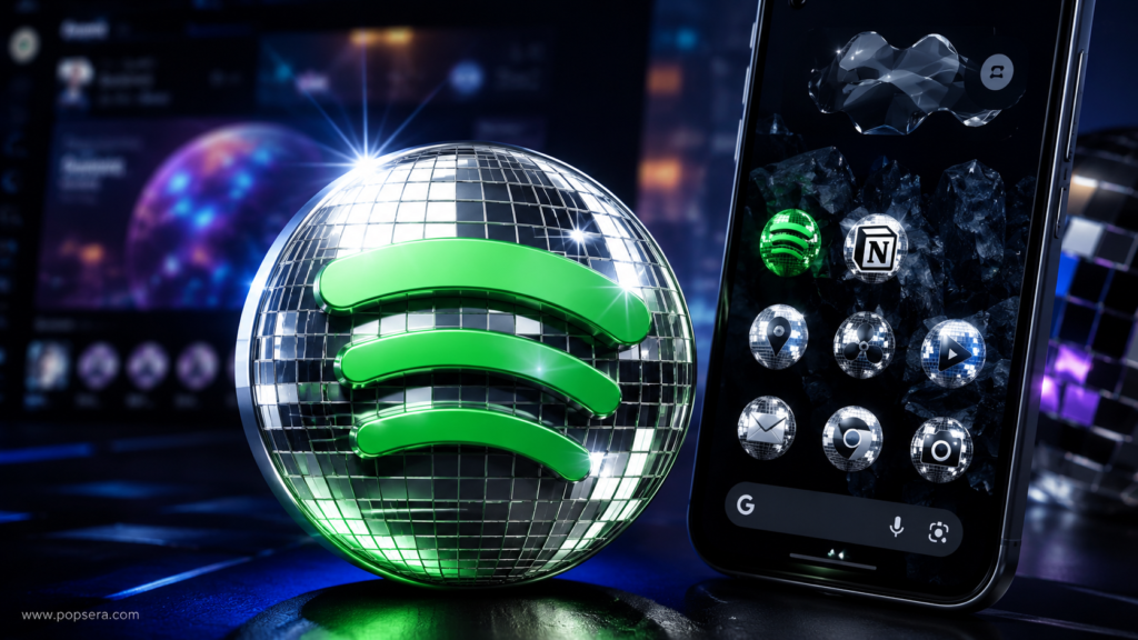

Discomorphism is what happens when the internet sees one shiny Spotify icon, gives it a fake design school name, and turns it into a full-blown logo trend before the week is over.
The term refers to app icons and brand marks redesigned with disco-ball textures: mirror tiles, glossy highlights, chrome-like reflections, dramatic lighting, and just enough chaos to look intentionally unserious. It is not a formal design movement, at least not yet. It is closer to a meme with surprisingly good visual instincts.
The spark was Spotify’s 20th-anniversary campaign. In May 2026, Spotify temporarily swapped its familiar green app icon for a green disco-ball version as part of its Spotify 20 celebration. Some users hated it. Designers noticed it. Creators started remixing other logos. Then the word “discomorphism” gave the joke a name.
The meaning of Discomorphism is simpler than it sounds
Discomorphism combines “disco” with “skeuomorphism,” the older design idea of making digital objects borrow from physical-world materials or objects. Think early smartphone apps that looked like paper notebooks, leather calendars, or wooden shelves.
Discomorphism is much narrower and much sillier. It does not make an app easier to understand. A disco-ball ChatGPT logo would not explain how AI works. A mirrored Notion icon would not make databases clearer.
That is partly why the trend works. It is decorative, instantly readable, and low-stakes. The whole point is that a serious brand mark gets dressed for a party.
How Spotify’s temporary icon became a design meme
Spotify did not quietly test a new logo system. The company tied the disco-ball mark to a birthday campaign, and the change was temporary from the start. Still, changing an app icon is unusually personal. Icons live on home screens, muscle memory matters, and even a short-lived redesign can feel disruptive.
That reaction gave the icon more life than a normal brand campaign would have had. The backlash made people look. The visual style made people remix it.
Designer and creator Race Johnson helped push the term into wider circulation after posting a set of shiny, disco-style app icons and labeling the look “discomorphism.” From there, the idea became easy to copy: take a recognizable logo, keep the silhouette, cover it in mirror tiles, add dramatic reflections, post it before the joke cools off.
That speed matters. Discomorphism did not spread because it was refined. It spread because it was easy to understand in half a second.
Why brands jumped on it so quickly
Brand accounts love a trend they can join without explaining themselves. Discomorphism gave them exactly that.
Unlike a complicated meme format, the visual joke was self-contained. A brand did not need a caption thread, a campaign landing page, or a deep cultural reference. The transformed logo was the joke.
For social teams, the appeal is obvious: it is visual, fast, nostalgic, and harmless. Nobody has to pretend a mirror-tiled logo is the future of brand identity. It can just be fun for a day.
Discomorphism also says something about design fatigue
The joke landed because digital design has spent years sanding off texture. Flat logos, simple icons, clean gradients, and minimalist wordmarks became the default language of modern apps. That look is useful, scalable, and safe. It is also easy to parody because so many brands now feel visually related.
Discomorphism pushes in the opposite direction. It is shiny, tactile, noisy, and almost proudly impractical. On a tiny home-screen icon, all those reflections can become visual mush. As a social post, though, the look pops immediately.
That is the split at the center of the trend. Discomorphism works better as internet content than as everyday interface design.
Is Discomorphism a real design trend or just a meme?
Right now, it is both, but the meme is doing most of the work.
As a serious UI direction, discomorphism has obvious limits. Disco-ball textures are busy. They do not scale cleanly at small sizes. They can reduce clarity. They are also tied so strongly to the joke that a brand using the style too late may look like it missed the moment.
But as a signal, it is useful. The trend shows that people are hungry for more expressive digital surfaces. Designers have already been revisiting depth, glass, shadows, dimensional icons, and material-like interfaces. Discomorphism is the loudest, least subtle version of that mood.
It is not the new minimalism. It is the reaction image to minimalism.
Google’s Pixel icons made the joke feel more real
The trend moved beyond mockups when Google added a “Disco” custom icon pack for Pixel phones. The feature gave users a way to apply the mirror-ball treatment across their home screens, turning what started as a social design joke into an actual phone customization option.
Sameer Samat shared the Pixel Disco icon option on X, showing how quickly the trend moved from social posts into phone customization: see the Google Pixel Disco icons post.
That does not mean every major platform is about to go full disco. It does mean brands are watching internet design culture move in real time, then responding faster than they used to.
A decade ago, a viral design gag might have stayed on Dribbble, Tumblr, or Twitter. In 2026, it can become a generator, a prompt format, a brand post, and a phone icon pack in days.
The real lesson is speed, not sparkle
The tempting takeaway is that every logo now needs chrome tiles. That is the wrong read.
Discomorphism worked because the timing was perfect: Spotify had a real anniversary hook, the icon was divisive enough to create conversation, creators had AI tools that made remixing easy, and the name was funny enough to travel.
The design itself may fade quickly. Most internet trends do. But the pattern is worth watching. A brand moment now becomes participatory when people can copy it, rename it, automate it, and push it across platforms before the original campaign is even finished.
That is why Discomorphism is more than a shiny logo gag. It is a small snapshot of how internet culture handles design now: fast, collaborative, unserious on the surface, and surprisingly good at turning one visual joke into a shared language.
For most brands, the safest move is not to redesign around it. It is to understand why people wanted to play with it in the first place.